Recently I learned about a SUPER awesome little library that you should consider adding into your projects: The Percent Support Library.
This library allows you to specify a percentage value for layout width and height when you are using RelativeLayout or FrameLayout. Yipee!!!! Gone are the days of switching everything over to a LinearLayout when you realize halfway through coding that you really need weights in your layout.
First step is to pull the library into your project. Just add this line in your app level build.gradle:
compile 'com.android.support:percent:23.0.0'
Now you can use percents in your XML layout files. The library defines a new layout type called PercentRelativeLayout, which inherits from RelativeLayout. Here is a basic example on how to use it:
<android.support.percent.PercentRelativeLayout xmlns:android="http://schemas.android.com/apk/res/android"
    xmlns:app="http://schemas.android.com/apk/res-auto"
    xmlns:tools="http://schemas.android.com/tools"
    android:layout_width="match_parent"
    android:layout_height="match_parent"
    tools:context=".MainActivity">

    <ImageView
        android:id="@+id/centered_image_2"
        android:layout_gravity="center"
        android:contentDescription="Android Robot"
        android:src="@mipmap/ic_launcher"
        app:layout_heightPercent="30%"
        app:layout_widthPercent="50%" />

</android.support.percent.PercentRelativeLayout>
Note that you must include percent symbols as units when defining the parameters (in place of dp).
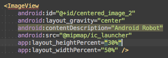
One thing to note here is that the Android Studio lint GUI component gets a little confused by percent layout. Lint is probably checking every layout for the exact strings “android:layout_height” and “android:layout_width,” the only two required elements for a View. Because these exact strings are not found when using percentages for width and height, you get the sad little red error squiggles like this:
But don’t worry. Even though the GUI is showing an error, the project can still successfully build.
You can also mix and match percents and regular old school layout dimensions. Here I’m setting a height of wrap_content, but a width of 50%:
<ImageView
        android:id="@+id/centered_image_1"
        android:layout_height="wrap_content"
        android:layout_gravity="center"
        android:contentDescription="Android Robot"
        android:src="@mipmap/ic_launcher"
        app:layout_widthPercent="50%" />
One tiny annoyance with this combo of percent and regular for width and height, is that Android Studio code auto-format (opt + cmd + L) won’t automatically place width and height next to each other.
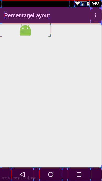
And you can see it accurately reflected here, taking up 50% of the screen width, but wrapping to the original height of the image:
By the way, this “show layout bounds” view is a handy trick to check your layout bounds when running an app on your device. Just go into Developer Settings on your device, and select Show Layout Bounds. Then you will see layout bounds for everything that is drawn on your screen. The red lines are the “optical bounds,” blue lines are “clip bounds,” and pink shading indicates your margins. Not only is this useful for debugging your own app’s layout, it is also a handy way to gain insight on how other app’s organize their layout!
Documentation for the Percent Relative Layout view can be found here. Documentation for the Percent Support Library can be found here.


Hello Kelly 🙂
I need talk with you, please send me an email.
Thanks